CLIENT
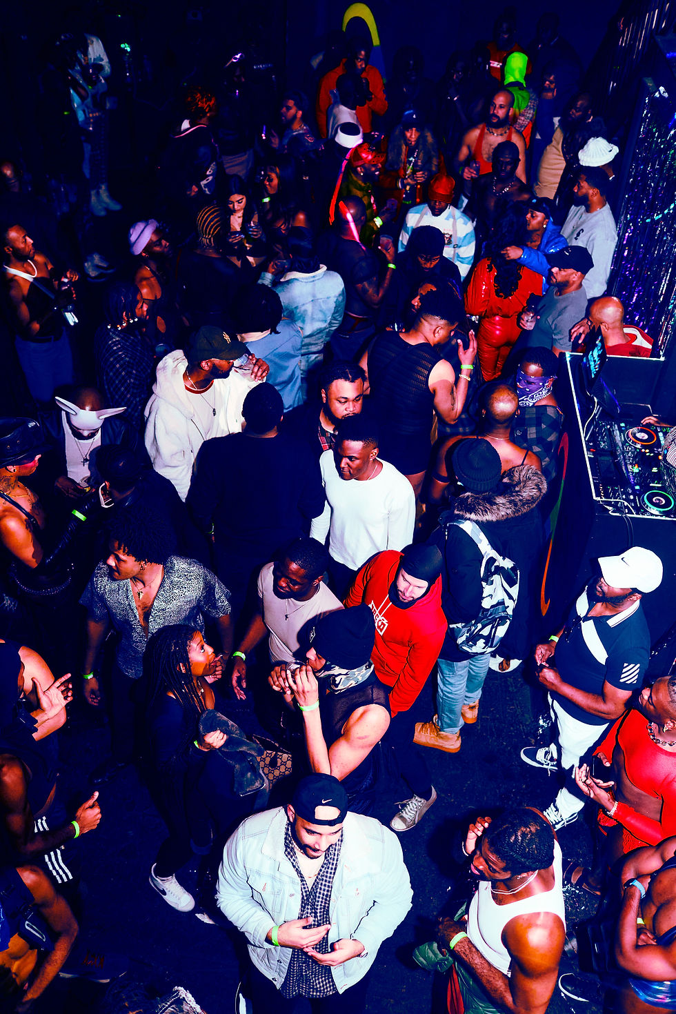
Deviant Events / Counter Culture
TYPE OF CLIENT
Culture & Community
CATEGORY
Creative Direction · Brand & Visual Strategy
ROLE
Creative Director
TASK
Create a unified brand system for both Deviant’s nightlife events and its nonprofit counterpart, Counter Culture—balancing bold expression with accessible community engagement.
OUTCOME
Led creative direction for a dual-brand system that positioned Deviant as a bold, nightlife experience, and Counter Culture as its community-driven counterpart—extending the brand into wellness, education, and accessible programming.


Evolving the Brand:
From Visuals to
Cultural Storytelling
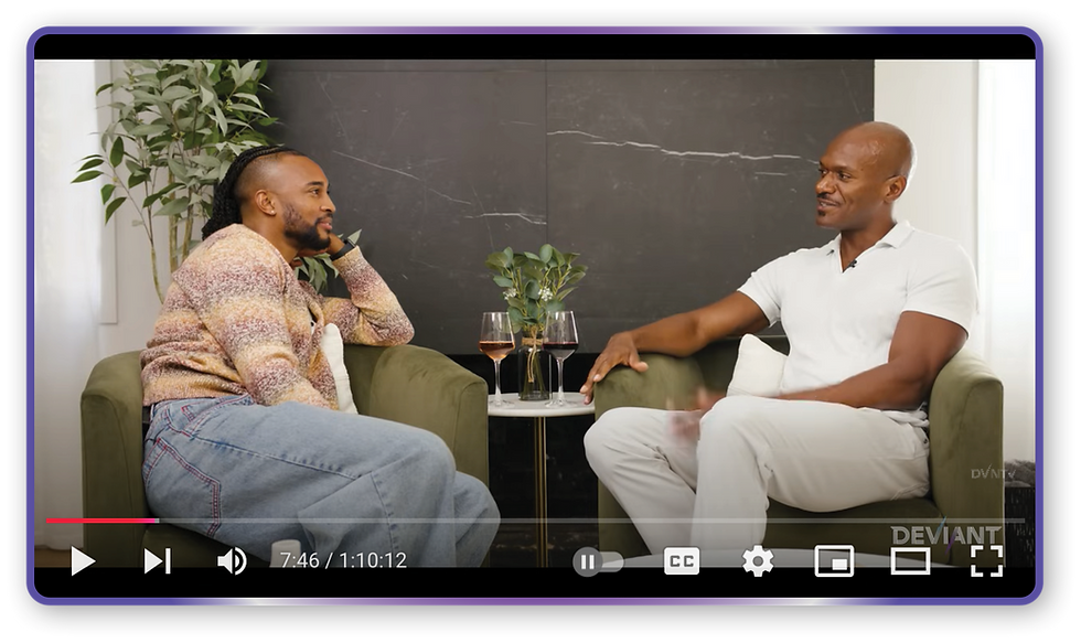
As Deviant’s creative director, I developed visual identities for its events and programs, ensuring each reflected the brand’s bold, intentional energy. I also created branded visuals for DVNTv, translating Deviant’s look and feel into digital content that expanded its storytelling beyond nightlife.


Branding the Culture:
Designing the Programs
That Power Deviant.
Shaped the brand identities and naming for Deviant’s core programs and major events—HOT100, TURNTUP, BBQ (Black Brown Queer), and Red Dress Run. Each concept captured the pulse of the community, translating Deviant’s bold energy into distinctive, memorable experiences. The work extended across digital collateral for social media, apparel and merch for major events, and print pieces designed as lasting leave-behind moments.

A festival event to provide space for community, resources, and entertainment.
Black Brown Queer (BBQ)

HOT 100 Initiative
A health initiative partnership with health resources with a 100 patrons goal of get tested without stigma.

A charity run that Deviant has reshaped the weekend into destination event for New Orleans.
Red Dress Run

A breakout party from the signature Deviant party.
It's an expansion to more nightlife avenues.
TURNTUP


The visual branding for Counter Culture extended across all community events and programming—field trips, movie nights, field days, and speaking panels. Each design touchpoint carried the same bold yet approachable identity, blending inclusive visuals with playful elements that reflected the heart of the community. Beyond collateral, the brand came to life through conversations and cultural programming that strengthened Counter Culture’s connection to its audience.


-67.jpg)
